GCOO In-App Store Case Study
Summer 2025 Internship
Before

After

At-a-glance
GCOO is South Korea's leading micromobility company with 2.5 million users worldwide. It provides rental electric scooters and bikes for both riders and delivery workers. GCOO is undergoing a major redesign to boost user retention. I spent 3 months on the product design team, focusing on re-designing the in-app store, which offers one-time and subscription passes. I used Figma as my main prototyping, presentation, and design tool.
Final GCOO Presentation Figma Slides (contains prototypes of workflows): https://www.figma.com/slides/eMFObqOZgS4Hz46icCdol0/GCOO_Final_Presentation?node-id=1-1951&t=dnNiUnBLtPv76Icb-1
Figma WIP File: https://www.figma.com/design/KHF6nmEHtBzyPqxyZtVAiv/GBIKE-Internship?node-id=33-2&t=kxhRsbUhcl8ScMos-1
UX Research
I conducted market & competitor research by reading earning reports, using competitor apps in-depth, listening in on meetings with GCOO product managers. To give a couple of observations, GCOO had an increase in new riders but an even greater increase in churn signifying to me that the app user flow lacked efficiency. Monthly revenue per device dropped; however, overall market share increased. Finally, the actual demographic of people leaving GCOO was in users in their 20s. The decrease in younger people using GCOO could be attributed to many reasons; however, I believe that it is mainly due to South Korea's overall population crisis.
The Problem
GCOO overall user base is decreasing due to an outdated in-app store user workflow and a lack of optimization for its older audience.
The Solution
Looking at these problems I recognized the solution was in improving the accessibility of the app and re-designing of the GCOO in-app store. Older people gravitate towards visual indicators and respond to readable content. Office workers, require a user workflow that requires the least amount of clicks and is affordable. I factored this into my solution creating the least of amount of steps to get to the store in-app and re-defining the types of passes available.
Step 1: Increase visibility of store from the home page
Before Re-Design

Menu is small and has no indication that it opens an option to open the in-app store
GCOO in-app store banner is only displayed sometimes vs. being statically present on the home page
After Re-Design
New designs provide static banners and distinctly emphasize the existence of the store to the user.


Step 2: Re-design the card design for options available
Before Re-Design

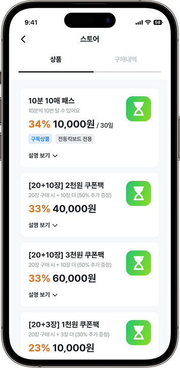
Pass names and descriptions are potentially confusing to the user
Pricing & discount is unclear to the user
After Re-Design
New designs take into consideration guiding user gaze towards different parts of the pass such as pricing, the buy now button, and the image icon. These are all meant to make the options more digestible to an older audience and an audience focussed on getting vital information about these passes as quickly as possible.


Step 3: Cut out or re-design features that either cause confusion or were unecessary
Before Re-Design

Dropdown disrupts user experience by moving the other card option when opening the dropdown
Dropdown has a lot of information that is difficult to see/read for the average GCOO user

Purchase UI is repetitive and potentially confusing
After Re-Design
New designs take advantage of overlays instead of dropdowns, providing the user with a cleaner and more streamlined method of viewing important pass information and purchasing GCOO products.


Final Thoughts
In my time at GCOO I not only sharpened my Figma skills but I really got to understand how design systems are built and how UX designers build workflows. Entering a Korean-speaking workplace without knowing the language, I relied on ChatGPT, real-time translation tools, and learning Korean on my own time to listen in on meetings and work with co-workers. I worked with multiple different teams to see this project come through and really got a good understanding of how a product feature is made from start to end. I enjoyed my experience here and hope to use my new skills to build even better products in the future.

